Labels: New Google Analytics
This is part of our series of posts highlighting the new Google Analytics. The new version of Google Analytics is currently available in beta to a small number of Analytics users. We’ll be giving access to more users soon. Sign up for early access.
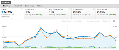
The graph on top of most Google Analytics reports is designed to give you a quick overview of your site’s performance over time. From the graph it’s easy to spot trends and understand how your traffic has changed over time. One request we heard was the ability to quickly focus the graph on a particular row of data. While you could do this with a drill-down report or using an advanced segment, we saw this as an opportunity to provide an easy way to do quick comparisons in the new Google Analytics.
Say for example you’re examining your site’s traffic by traffic source. You can see there are peaks and valleys in the traffic, but if you want a sense of the major contributors, you need to dig into the table.
With Plot Rows, you can graph any two rows alongside the overview. You can then easily determine how much a row contributes to the whole. Or you can compare two lines against each other to look for comparison trends.
To use Plot Rows, just tick any one or two checkboxes next to the rows you want to plot, then at the bottom of the table, hits the Plot Rows button.
Remember, that some reports like New vs. Returning default to a Pie Chart view. This doesn’t mean you can’t use Plot Rows, just switch the view to Data, and you’re good to go.
Here’s a quick video showing this in action:
Usage Tips
When looking at continuous metrics, like Visits, Plot Rows is most revealing when exploring the rows of similar scale, for example to see how they contribute to the whole and change over time. When looking at rows at different scales the graph will be more informative when using percentage metrics like Bounce Rate.
In this example, we’re looking at organic search traffic driven to the Google Store from Google and Bing. One would not expect that Bing users are actively looking to buy Google merchandise (like this awesome t-shirt), so the number of visits is understandably low. Since the traffic from Bing is relatively low, the graph doesn’t share much we didn’t already know from the table.
In new version of Analytics you can quickly graph any of the metrics in the scorecard (the bar on top of the graph) by clicking on the metric in the scorecard. Looking at Bounce Rate, we can see that over time the Bounce Rate from Google search (orange) has dropped, which has reduced the overall Bounce Rate of the site (blue), while the Bounce Rate from Bing (green) has more or less stayed constant.
You can use Plot Rows in just about any report that has a data table. Let us know if you find a place you want this functionality that doesn’t already have it. Also, we’re planning to give a bunch more of you access to the new version this week. Be on the look out!


No comments:
Post a Comment